
YAGOOT system refresh
Yagoot has a Cincinnati cult following with an already established brand identity but needed to be updated to reflect a modern, polished aesthetic, capable of competing with larger competitors in the franchise space. Updated design guide CLICK HERE.


Yagoot Brand Guide | Creative Direction, Design
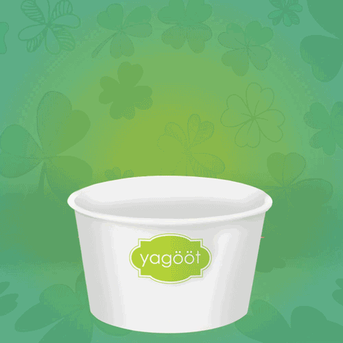
YAGOOT LOGO REFRESH

Old Logo - The blocky font and what is referred to as the “glot” frame has been iconic symbology for the brand since its inception. The color and hard lines however needed some “glow-up” to get more energetic but approachable feel
New Logo - The updated logo has not changed a whole lot from the original (and yes the glot still remains in the brand family). The font was manipulated at the end lines for softer stops and closer kerning keeps everything together nicely.
MONTHLY MARKETING CAMPAIGNs
I developed a series of IG/FB informational social posts on a recurring monthly basis. Below Is a single month to show the extent of the marketing program.
CLICK HERE for the entire marketing schedule for the month


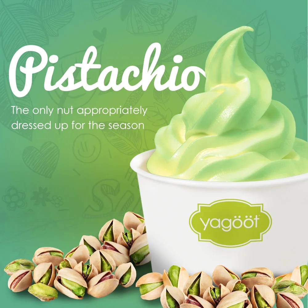


MONTHLY MARKETING Highlights
Month-over-month our theme changed, these are just a few of the other themes I put together over the year


